Why Image SEO Matters More Than Ever
Many brands come to us with strong content, compelling offers, and gorgeous websites—yet they’re still not seeing the organic traffic they expected. One of the most common culprits? Unoptimized images.
It’s easy to overlook images in an SEO strategy. After all, visuals are often added for design and user appeal. But without the right optimization, those same visuals can slow your site down, confuse search engines, and hold back your rankings. We’ve audited countless sites where the content was solid, but the images—oversized files, poor filenames, missing alt text—were quietly sabotaging performance.
Search engines rely on structure and clarity. They can’t “see” images the way humans do—they read them. That means every image needs to be labeled, compressed, and formatted correctly to support your SEO goals. Done right, images can improve load speed, boost discoverability through Google Images, enhance accessibility, and strengthen your overall keyword strategy.
In this guide, we’re walking you through step-by-step on How to Optimize Images for SEO—from choosing the best file format to implementing schema markup. Whether you’re managing a content-heavy blog, a fast-paced Shopify store, or a sleek corporate site, these best practices for image SEO will help your visuals work as hard as the words around them.
Need expert help implementing these optimizations? Elkostart specializes in turning overlooked website elements into powerful growth drivers. Book a free consultation today and let’s unlock your site’s full SEO potential.
1. What Is Image SEO and Why Is It Important?
Let’s start with the basics—because you can’t master a game if you don’t know the rules.
Imagine your website as a bustling gallery. Every image is a piece of art, carefully chosen to capture your visitor’s attention. But if there’s no label, no description, no title—how would anyone (let alone a robot like Google) know what it’s looking at?
That’s where image SEO comes in.
At its core, image SEO is the process of making your images understandable to search engines. Since search engines can’t see images the way humans can, they rely on clues—like filenames, alt text, and context—to figure out what the image is about and whether it’s relevant to someone’s search.
Here’s how I explain it to clients: Think of Google as a blindfolded art critic trying to understand your website. Your job? Describe every image so vividly that they don’t need to see it to appreciate it.
So, what does image SEO actually do?
- Improves visibility in image search (Google Images gets billions of hits a day)
- Boosts page speed—and faster pages mean better rankings
- Helps screen readers and improves accessibility, which matters for UX and compliance
- Supports your keyword strategy by giving search engines more semantic signals
I once optimized just the images on an old, low-traffic blog post. Same text, same layout—just better file names, alt text, compression, and schema. Within two weeks, it had jumped from page 4 to page 1 on Google. Just from images.
So if you’ve been wondering, “Why is image optimization important for SEO?” — the answer is simple: because Google rewards websites that play smart, not just look pretty.
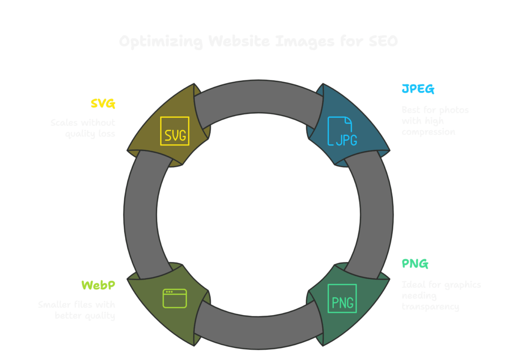
2. Choosing the Right Image Format
Think of your website like a finely tuned machine. Every component—from your copy to your code—needs to run efficiently. Images? They’re a major part of that system, and the file format you choose can either streamline performance or slow things down like sand in the gears.
We often see websites using beautiful, high-resolution images that look fantastic—until the page takes forever to load. That’s where format decisions come in. Choosing the right type of image file isn’t just a design decision—it’s a critical step in image size optimization for faster loading and better SEO.
So, what’s the best image format for SEO?
There’s no one-size-fits-all answer. It depends on the image’s purpose, where it’s being used, and how much quality you need to preserve. Here’s how we typically break it down for clients:
🔸 JPEG (or JPG)
- Best for: Photos and detailed visuals with gradients
- Why use it: High compression with decent quality
- SEO bonus: Keeps file sizes small, which speeds up load times
- Caution: Too much compression can create visible artifacts
Real-world tip: We’ve seen homepage sliders go from 3MB to under 400KB just by converting from PNG to JPEG—without any noticeable loss in quality. That speed boost can make a real difference for both rankings and bounce rates.
🔸 PNG
- Best for: Graphics, logos, images needing transparency
- Why use it: Preserves sharpness and edges, supports transparency
- SEO caution: Larger file sizes can impact site speed
🔸 WebP
- Best for: Modern browsers and performance-first websites
- Why use it: Smaller than JPEG/PNG with equal or better quality
- SEO advantage: Google developed it—so naturally, it plays well with search engine performance metrics
- Pro insight: Using WebP across a WordPress blog or Shopify store can improve Core Web Vitals with minimal effort
🔸 SVG
- Best for: Logos, icons, and simple illustrations
- Why use it: Scales infinitely with no loss of quality
- Bonus: Lightweight, resolution-independent, and perfect for responsive design
- Note: Only use SVGs for vector-based images—don’t try to convert photos into this format
Choosing the right format is just the beginning. At Elkostart, we help businesses optimize every image, tag, and technical detail to boost speed, search rankings, and user experience. Want us to take a look under the hood? Schedule a free site audit and see how much performance you’re leaving on the table.
Keyword Tip:
When explaining formats to clients or content teams, we often frame it like packing for a trip:
- JPEGs are like rolling clothes to save space (a bit wrinkled but compact)
- PNGs are neatly folded, but take up more room
- WebPs are those clever packing cubes—lightweight and organized
- SVGs? They’re the digital passport—clean, scalable, and essential
Choosing the right image format is one of the best practices for image SEO, and it’s the foundation for everything else we’ll cover—compression, loading speed, and even mobile performance. By starting here, you set yourself up for a faster, more search-friendly website that both users and algorithms will appreciate.
3. Compressing Images Without Losing Quality
If choosing the right format is like packing smart, compression is like using vacuum-seal bags—you squeeze out every unnecessary byte without ruining what’s inside.
Here’s the reality: even when websites use the right formats (JPEG, WebP, etc.), we still see massive, bloated images slowing down performance. And since page speed is a critical ranking factor—especially with Google’s Core Web Vitals—this isn’t something you can afford to ignore.
One of the first things we do during an SEO audit is run a site through PageSpeed Insights or GTmetrix. Nine times out of ten, the biggest red flag? “Defer offscreen images” and “Properly size images.” Translation: your images are too large, and they’re hurting your SEO.
So, how do you compress images without losing SEO value?
Let’s break down image compression tips for SEO—the methods and tools we recommend to clients across different platforms.
Use Reliable Compression Tools
We regularly recommend the following tools to optimize images without sacrificing quality:
- TinyPNG – Great for PNGs and JPEGs; drag-and-drop ease
- ShortPixel – Offers glossy, lossless, and lossy compression; perfect for WordPress
- ImageOptim (Mac) – Powerful for local compression before uploading
- Squoosh (by Google) – Browser-based, lets you preview the trade-off between size and quality
- Kraken.io – Scalable solution for ecommerce and high-volume platforms
Pro Tip: Use these tools before uploading images. Compressing locally ensures you’re not storing bulky originals on your CMS.
Choose the Right Compression Type
There are two types of compression, and picking the right one depends on what you’re optimizing:
- Lossless Compression
Retains every pixel of the original image—great for logos, product shots, and anything where sharpness is key.
Use when quality matters most. - Lossy Compression
Removes redundant data to drastically reduce file size. It may slightly degrade quality, but it’s often unnoticeable to users.
Use when performance is the priority.
We typically recommend glossy compression (a middle ground) for blogs and ecommerce product images. It balances visual clarity with lightning-fast load times.
Real-World Impact
On a recent client site—an ecommerce store with hundreds of product images—we reduced total page weight by 45% just through image compression. Not only did that improve load time and mobile experience, but it also bumped their Google Lighthouse performance score from 67 to 91.
How can I improve image SEO on my website? Start by compressing every image—especially those on your homepage, blog headers, and category pages.
Quick Checklist: Compressing Images for SEO
- Compress images before uploading
- Choose the right balance (lossy vs lossless)
- Use automation tools or plugins for bulk compression
- Regularly audit image sizes with PageSpeed Insights or GTmetrix
Image compression isn’t just a technical step—it’s one of the most impactful SEO techniques for image optimization. And when you get it right, your users, your bounce rate, and your rankings all win.
4. File Naming – How to Name Images for SEO
You wouldn’t upload a CSS file named file_final2_REAL.css—so why treat images any differently?
Image file names are your first shot at helping search engines understand what your visuals are about. In web creation, especially for portfolio pieces, landing pages, or blog posts, meaningful file names are just as important as clean code or well-written copy.
Yet we still see it: entire libraries of images named IMG_4832, screenshot-final-edit-v3, or headerimage2.
This small detail often gets lost in the hustle of design or content updates, but in SEO, it matters. A lot.
Why Are File Names So Important for Image SEO?
Google reads your image file name as a direct signal of relevance. It’s one of the first things it scans to connect the image to your page content. A keyword-rich, descriptive name gives your site an edge in both web and image search results.
Think of it like naming a component in a development project—you wouldn’t name a crucial function thingy(). You name it something that tells the system exactly what it does. Same goes for your images.
How to Name Images for SEO: Agency-Proven Best Practices
When our team works on client sites—whether it’s a brand-new WordPress build or an SEO refresh—we apply the same structured naming system to keep visuals optimized and organized.
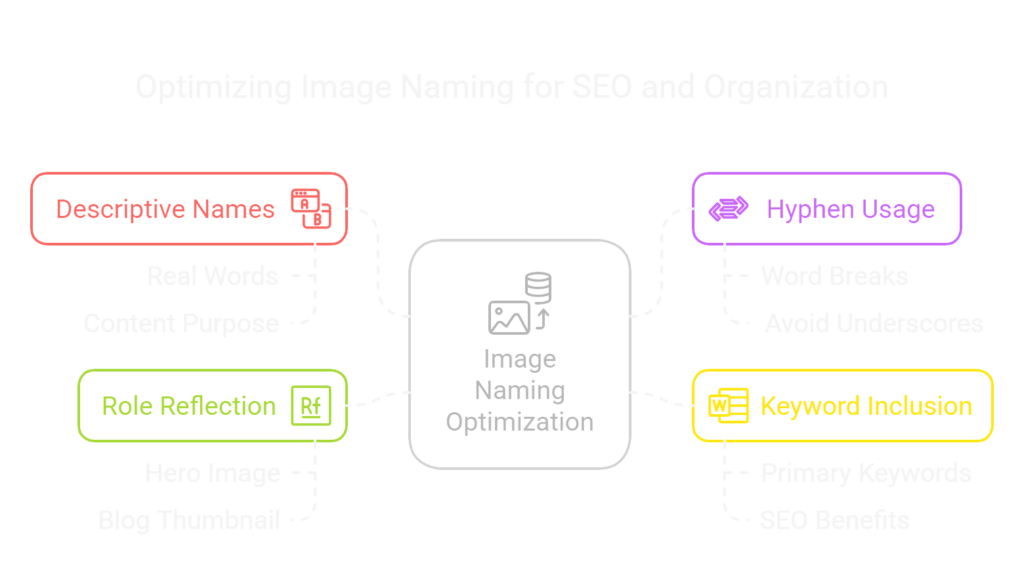
Be Descriptive and Human-Friendly
Use real words that describe the image’s content and purpose.
- ❌ IMG-3942.jpg
- ✅ homepage-hero-wireframe-v2.jpg
Use Hyphens to Separate Words
Search engines read hyphens as word breaks. Underscores get ignored.
- ✅ web-design-services-hero.jpg
- ❌ web_design_services_hero.jpg
Include Primary Keywords
Just like page titles or headings, keywords help establish relevance.
- ✅ seo-dashboard-screenshot-analytics.jpg
- ✅ responsive-design-mobile-vs-desktop.jpg
Reflect the Image’s Role in the Page
Is it a hero image, a testimonial photo, a blog thumbnail? Say so.
- ✅ case-study-section-wireframe.jpg
- ✅ client-logo-carousel-slider.jpg
Agency Insight
During a redesign for a SaaS client, we reviewed their blog images and noticed everything was uploaded as generic filenames from stock sites. No keywords, no structure. We renamed each image using a clean, consistent system—focusing on core services, product names, and UI feature callouts.
Within one month, we saw image impressions increase by 78% in Google Search Console. Not only that, their blog started appearing in Google Images results for terms like “SaaS dashboard UI” and “lead gen automation tool.”
File Naming SEO Checklist
- Rename every image before uploading
- Use hyphens instead of underscores
- Incorporate relevant keywords naturally
- Match names to image function (hero, section, feature, etc.)
- Avoid filler or duplicate names like image2.jpg, screenshot_final.jpg
In web creation, details like naming might feel invisible—but they build the structure Google needs to understand and rank your site. Every optimized file name adds a brick to your SEO foundation, supporting faster indexing, higher rankings, and a more future-proof web presence.
5. Using Alt Text and Titles Effectively
Alt text often gets treated like a minor accessibility feature—but in our experience, it’s a strategic SEO lever that also happens to make your site more inclusive. Done right, it improves image discoverability, supports semantic relevance, and helps screen readers deliver a better browsing experience.
At our agency, we see alt text as the HTML handshake between visuals and search engines—it explains your images in plain language, adding depth to your on-page SEO and building a more structured, accessible site.
What Is Alt Text—and Why Does It Matter?
Alt text (alternative text) is an attribute that describes the content of an image. Its purpose is twofold:
- Accessibility: Screen readers use it to communicate image context to visually impaired users.
- SEO: Google and other search engines use it to understand image content, influence rankings, and populate image search results.
When you treat alt text as part of your content strategy—not just an afterthought—it becomes one of the most valuable on-page image SEO tools in your arsenal.
Best Practices: How to Write Alt Text for SEO and Accessibility
We guide clients and content teams to approach alt text like writing a micro caption: clear, concise, and meaningful.
Be Descriptive and Direct
Describe what the image shows, keeping it short and specific.
- team collaborating on UX design prototypes
- custom dashboard UI for analytics platform
Use Keywords—But Only When They Fit Naturally
Here’s where your question comes in.
Should you use the page’s target keyword in image alt text?
Yes—when the image actually represents that keyword.
Let’s say your page is targeting:
“headless CMS development”
If the image shows a developer diagramming a decoupled content architecture, then:
- developer mapping headless CMS structure on whiteboard
That reinforces the page topic and describes the image accurately.
But forcing the keyword where it doesn’t fit? That’s a red flag.
- ❌ headless CMS development content backend frontend api (keyword stuffing + no clarity)
Google values contextual relevance over exact-match repetition. If your image supports the topic, include the keyword or a variation. If it doesn’t, use natural language that accurately describes the visual.
Don’t Start with “Image of” or “Picture of”
Screen readers already indicate that it’s an image—no need to repeat.
- ❌ Image of homepage redesign on tablet screen
- ✅ homepage redesign mockup displayed on tablet
Leave Decorative Images Empty
Use alt=”” for icons, borders, or background visuals that don’t carry content value. This keeps screen readers focused on what matters.
Title Attributes: Are They Worth It?
Title attributes (hover tooltips) can enhance UX in certain contexts—like image galleries or portfolios—but they don’t contribute directly to SEO. If used, they should complement, not duplicate, your alt text.
Agency Use Case
We optimized a blog series on frontend frameworks for a B2B software client. By adding clear, keyword-aligned alt text to all diagrams and UI screenshots—like vue.js reactive data binding example and comparison chart for React vs Angular performance—we saw measurable gains in:
- Google Images impressions
- Dwell time on key pages
- Semantic relevance for high-intent queries
Alt text helped the images reinforce the entire page’s SEO focus, not just exist for visual appeal.
Alt Text SEO Checklist
- Write concise, descriptive alt text for every meaningful image
- Use keywords only when relevant to the actual image
- Avoid filler phrases like “image of”
- Leave purely decorative images empty (alt=””)
- Don’t copy/paste the same alt text across multiple images
When done thoughtfully, alt text enhances your website’s accessibility, SEO performance, and overall professionalism. It’s not just the right thing to do—it’s a strategic move that adds invisible value to every visual asset on the page.
6. Image Size and Dimensions: Getting It Just Right
When it comes to building a fast, user-friendly website, image sizing is often overlooked—but it plays a major role in SEO, user experience, and mobile responsiveness. Oversized images can weigh down your site, leading to slow load times, layout shifts, and even lower rankings. That’s why image size optimization is a core part of our performance-focused web strategy.
Search engines like Google prioritize speed, especially on mobile devices. Tools like PageSpeed Insights and Lighthouse frequently flag issues like “Properly size images” or “Serve images in next-gen formats.” These aren’t minor warnings—they directly affect your Core Web Vitals and, ultimately, your rankings.
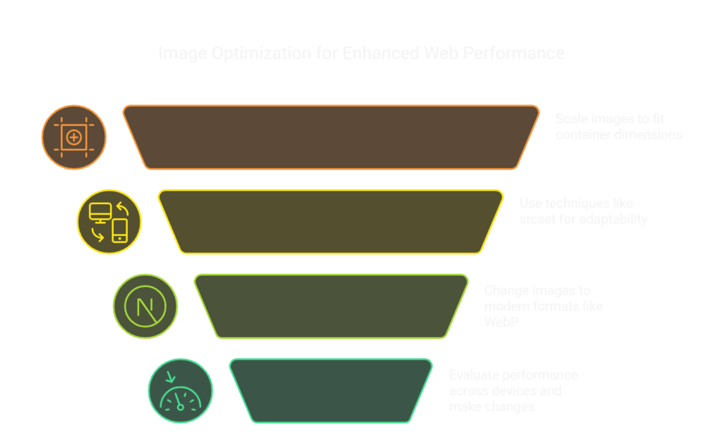
To improve SEO and loading times, every image on your site should be resized appropriately before upload. That means scaling images to fit the exact width of their container in your layout—rather than uploading a 2000-pixel-wide image for a section that only displays at 800 pixels.
For example, hero images or banners typically work best at around 1600 to 2000 pixels wide, depending on your layout and retina requirements. Blog post images often look sharp and load quickly at around 1200 pixels wide. Thumbnails and icons should usually be no larger than 150 to 300 pixels. And when it comes to backgrounds, it depends on usage—but loading them via CSS with cover behavior or lazy loading is a smart move.
Modern responsive design also demands that your images adapt to different screen sizes. That’s where responsive image techniques come in. Instead of serving the same image to everyone, developers can use HTML attributes like srcset and sizes (or platform-specific tools and plugins) to automatically serve the correct image size based on the user’s device. This ensures that desktop users get a crisp, high-res image, while mobile visitors receive a lighter version tailored for smaller screens.
For example, when we’re building WordPress or Shopify sites, we often automate image scaling with tools like ShortPixel Adaptive Images or built-in CDN scaling features. On headless CMS setups, we use tools like Cloudinary or Imgix to dynamically resize and serve images with optimal performance in mind.
There’s a real business impact to doing this right. In one project for a SaaS client, their homepage was using a single 3MB image across all devices—including mobile. After resizing it, applying responsive behavior, and converting it to WebP format, we reduced the mobile version to under 300KB. As a result, page load time improved by more than two seconds, and bounce rates dropped by nearly 20% within days.
To make image sizing work for you, the key is to resize your visuals before uploading them, avoid relying on CSS or HTML to scale down large images, and test how they display across desktop, tablet, and mobile breakpoints. Matching your image dimensions to your layout and screen strategy is one of the easiest ways to give your SEO and user experience a serious boost—without compromising visual quality.
7. Structured Data and Schema Markup for Images
8. Lazy Loading for Faster Sites
In modern web design, visuals play a huge role in storytelling, branding, and conversion. But here’s the challenge: the more images you add, the longer your site can take to load—especially on mobile or slower connections. And in a world where users expect pages to load in under three seconds, every kilobyte matters.
This is where lazy loading becomes a powerful tool in your image SEO toolkit.
Lazy loading is a technique that defers the loading of offscreen images until the moment a user scrolls near them. In other words, instead of loading every image on the page all at once, the browser only loads the ones currently in view. As users scroll down, additional images load dynamically—reducing the initial page load time and improving perceived performance.
From an SEO perspective, this directly benefits your Core Web Vitals, particularly metrics like Largest Contentful Paint (LCP) and First Contentful Paint (FCP). These are key indicators of how quickly your content becomes visible and usable—and Google uses them as ranking signals. By lazy loading your images, especially those lower on the page, you create a faster, more efficient experience for both users and search engines.
Implementing lazy loading has become easier than ever. Most modern browsers now support it natively through a simple HTML attribute. By adding loading=”lazy” to your image tags, you can activate this behavior without needing any extra scripts or plugins. For example:
					html
CopyEdit
<img decoding="async" src="team-collaboration.jpg" alt="Team collaborating during UX workshop" loading="lazy">
If you’re working on a WordPress site, many SEO and performance plugins—like WP Rocket or Smush—include lazy loading as a built-in option. For Shopify and other ecommerce platforms, lazy loading can be added through theme updates or third-party apps. And for headless or custom-built sites, your dev team can integrate it via JavaScript or a frontend framework.
Now, while lazy loading is a great performance tool, it should be applied strategically. Key images at the top of the page—like hero banners or above-the-fold visuals—should not be lazy loaded, because they need to be visible as soon as the page loads. Reserve lazy loading for images below the fold, where deferring them won’t impact the immediate user experience.
From a real-world performance standpoint, lazy loading often produces noticeable improvements. On a recent project for a resource-heavy blog, enabling lazy loading reduced total page weight by over 1MB and shaved nearly 2 seconds off mobile load time. That improvement alone helped increase mobile engagement and contributed to better ranking signals on several content-driven landing pages.
In short, lazy loading is one of the easiest, most effective ways to balance performance and image-rich design. It’s not about using fewer visuals—it’s about using them smarter. And in today’s competitive web environment, small speed gains can mean the difference between a bounce and a conversion.
9. Optimizing Images by Platform
While the core principles of image SEO remain consistent, the way you apply them often depends on the platform you’re working with. Different content management systems (CMSs) and ecommerce platforms offer different tools, limitations, and workflows when it comes to optimizing images. As a web creation agency, we always tailor our approach based on what tech stack the client is using.
For WordPress, image optimization is relatively straightforward, thanks to its vast plugin ecosystem. Tools like Smush, EWWW Image Optimizer, and ShortPixel allow you to compress images automatically, implement lazy loading, and even serve next-gen formats like WebP—all without touching a line of code. Many of these plugins also handle image resizing on upload, which saves time and ensures consistency across your site.
In Shopify, while you don’t have the same plugin flexibility, image SEO is still very doable. Shopify automatically compresses uploaded images to an extent, but we recommend pre-optimizing files before uploading—resizing them to fit your theme’s dimensions and using descriptive, keyword-rich filenames. Apps like TinyIMG or Crush.pics can also help with automated compression and alt text generation within Shopify’s framework.
If you’re working in a headless environment or building a custom web application, you have even more control—but it does require a more hands-on approach. In these setups, we often integrate image CDNs like Cloudinary or Imgix to serve dynamically resized, compressed images tailored to the user’s device and screen size. This ensures high performance without sacrificing flexibility or brand consistency. You can also build in responsive image behavior and lazy loading directly into your frontend components using frameworks like React, Vue, or Svelte.
Regardless of the platform, the core practices remain the same: resize and compress images before uploading, use descriptive filenames and alt text, and serve the right format for performance. The main difference lies in how you execute these steps, depending on your toolset.
By aligning your image SEO strategy with the specific strengths of your platform, you not only ensure better performance—you also streamline your workflow, making it easier to scale and maintain over time.
10. Image SEO Checklist and Tools
With so many elements involved in optimizing images for SEO, it’s easy to lose track of a step or two—especially when you’re juggling design, development, and content all at once. That’s why having a simple checklist can help keep your process tight and consistent.
Here’s a high-level walkthrough we use internally to guide image SEO across projects:
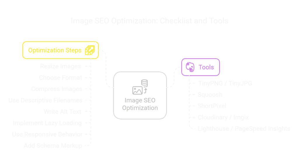
- Before uploading, always resize images to match their display dimensions. Avoid uploading huge files and letting CSS scale them down.
- Choose the right format: JPEG for photographs, PNG for graphics with transparency, SVG for icons and logos, and WebP for next-gen performance where supported.
- Compress all images using tools like TinyPNG, Squoosh, or ShortPixel. Aim for the smallest size possible without visible quality loss.
- Use clear, descriptive filenames that include relevant keywords. Replace generic names like “image1.jpg” with something meaningful, like “responsive-web-design-showcase.jpg”.
- Write alt text that describes the image accurately and includes keywords when appropriate—but avoid keyword stuffing.
- Use lazy loading for images that appear below the fold to improve page load speed.
- Implement responsive image behavior using srcset and sizes, or a platform-based alternative.
- Add schema markup (ImageObject or as part of other structured data) to help search engines better understand and index your images.
When it comes to tools, here are a few that we often recommend to clients and use ourselves:
- TinyPNG / TinyJPG – Lightweight browser-based compression
- Squoosh – Google’s advanced image compression and format conversion tool
- ShortPixel – A powerful WordPress plugin for image compression and WebP delivery
- Cloudinary / Imgix – Ideal for dynamic image resizing and delivery in headless or custom environments
- Lighthouse / PageSpeed Insights – To analyze image performance and pinpoint bottlenecks
By making this checklist part of your publishing or development workflow, you’ll ensure every image supports—not sabotages—your SEO goals.
Conclusion: Make Every Pixel Count
Optimizing images for SEO isn’t just a technical best practice—it’s a competitive advantage. In a digital landscape where speed, accessibility, and user experience all contribute to search rankings, images play a far more important role than most people realize.
Throughout this guide, we’ve covered everything you need to know to make your visuals SEO-friendly: from choosing the right format and compressing efficiently, to writing purposeful alt text and leveraging structured data. We’ve also looked at how to apply these strategies across different platforms and workflows, whether you’re managing a WordPress blog, a Shopify store, or a custom-built application.
At its core, image SEO is about giving your visuals the same level of attention and structure you give your text. Search engines may not “see” your images the way humans do—but with the right optimization, they can understand them just as clearly.
So whether you’re auditing your current site or launching something new, start thinking of every image as an opportunity: to rank better, load faster, and serve your users more effectively.
Now that you’ve got the full strategy, it’s time to put it into action—one image at a time.
Ready to elevate your visuals and dominate search results? Partner with Elkostart for expert web creation, SEO, and AI-powered performance solutions. Start Now